Analyze
This guide provides an overview of the Analyze tab, where you can review, compare, and visualize your processed data.
Video Tutorial
Watch the full guide on Guidde

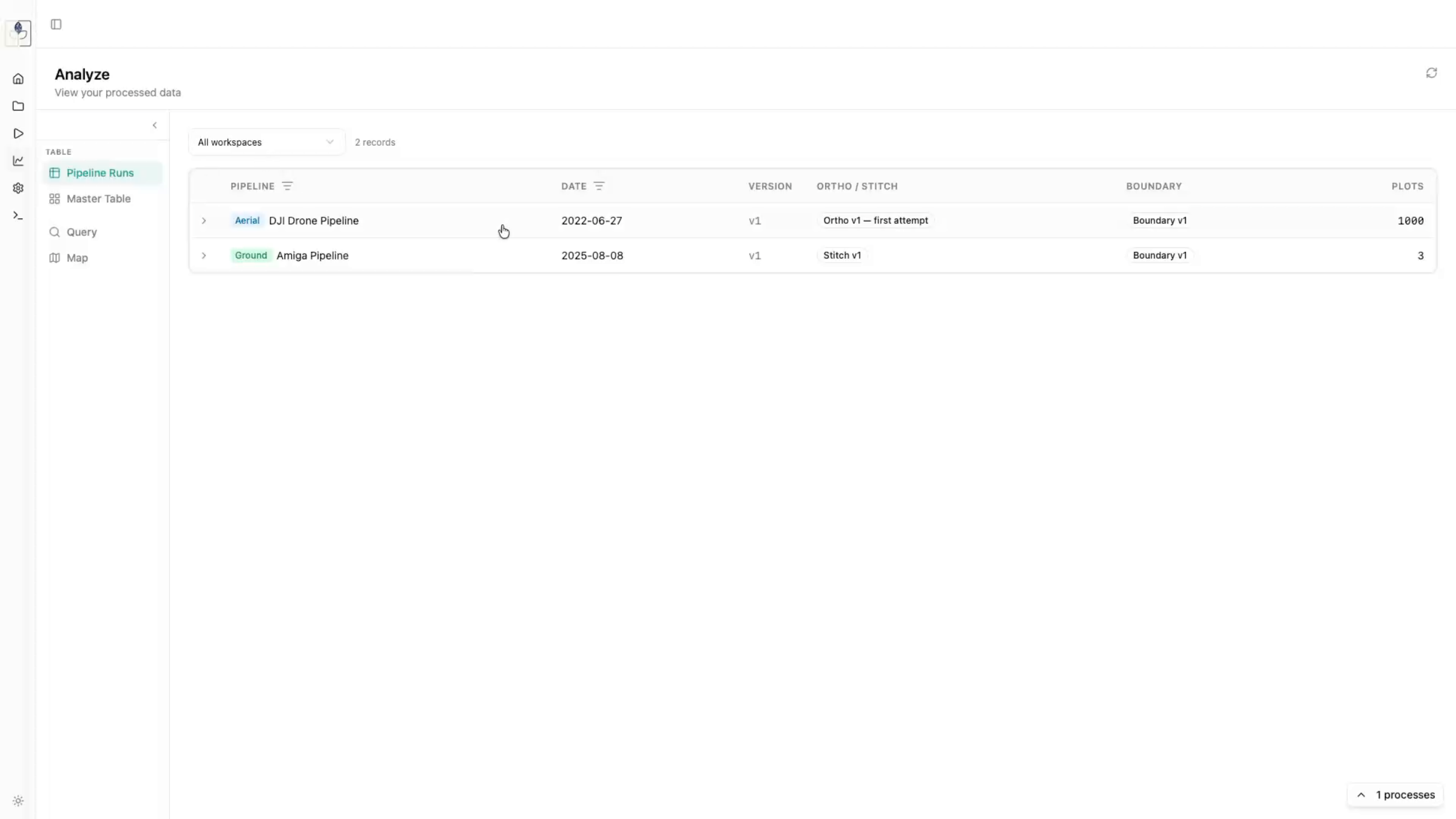
1. Pipeline Runs
The Pipeline Runs view allows you to see all processed pipelines across your workspaces.
- Click on any specific run to inspect individual plots.
- You can expand views for better visualization or rotate images to get a wider perspective of the field plots.
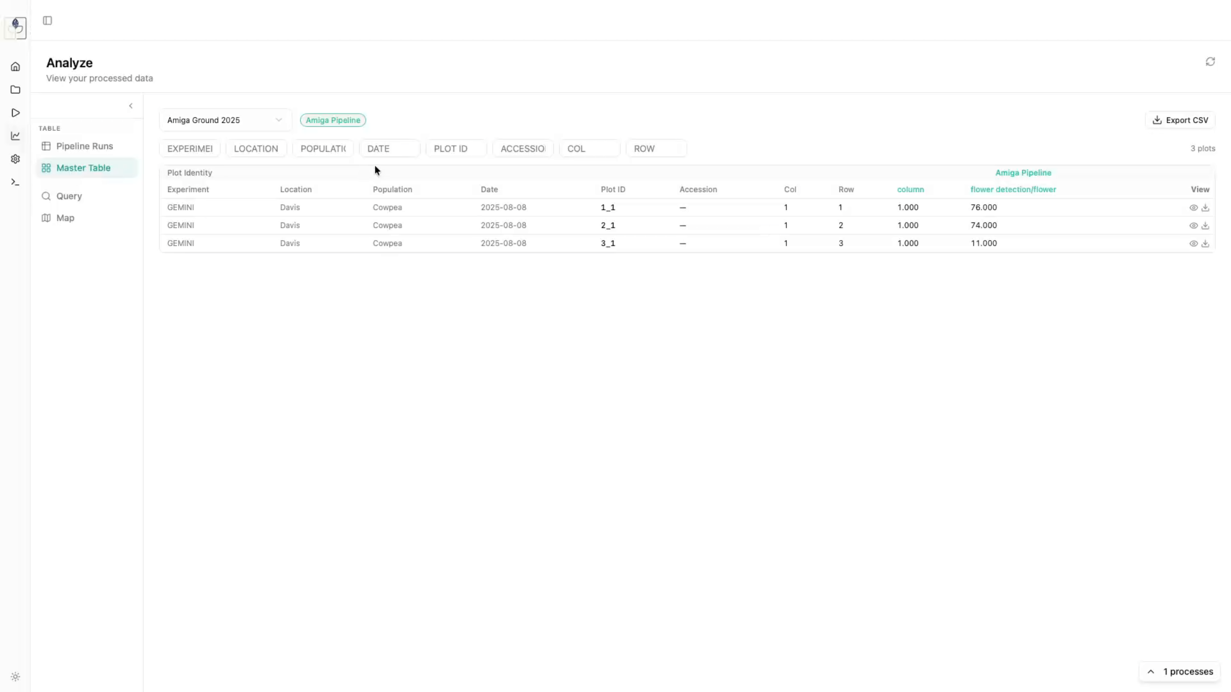
2. Master Table
The Master Table provides an aggregated view of all processed data. Unlike the Pipeline Runs view which shows individual events, the Master Table displays all dates collected and processed for each workspace.
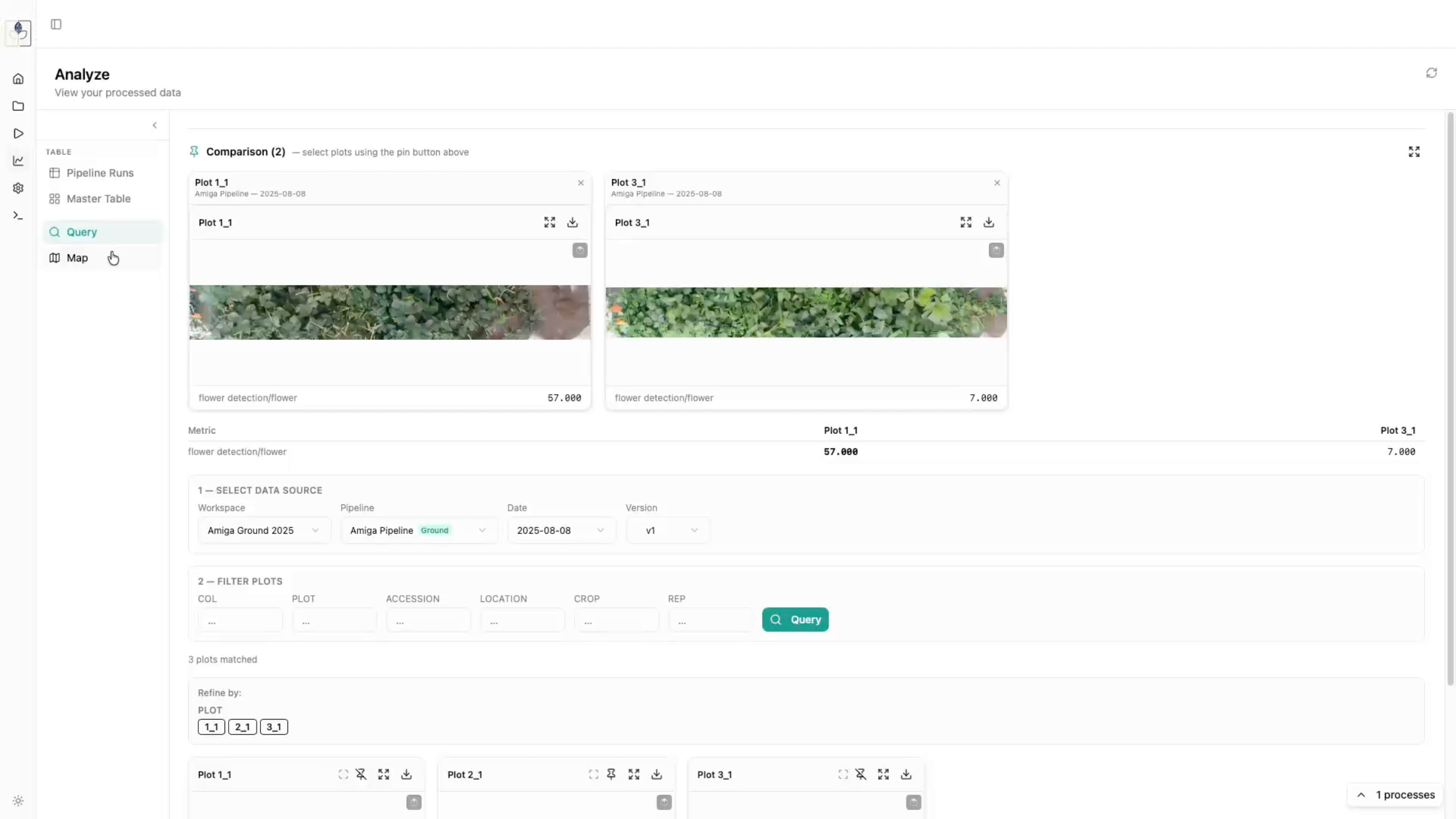
3. Query Tab
Use the Query tab to conduct side-by-side comparisons of your plots.
- Select a data source (e.g., "Stitches").
- Run a query to view plots.
- Click the Pin button on specific plots to add them to the comparison panel at the top. This allows you to view extracted trait data (e.g., height, vegetation fraction) for multiple plots simultaneously.
4. Map Tab
The Map tab provides a spatial perspective of your processed data.
- Overlays: See all orthomosaics and stitches together.
- Plot Boundaries: Overlay saved plot boundaries onto your imagery.
- Inspection: Click on any plot boundary within the map to get a closer view of the underlying orthomosaic or inference detections.